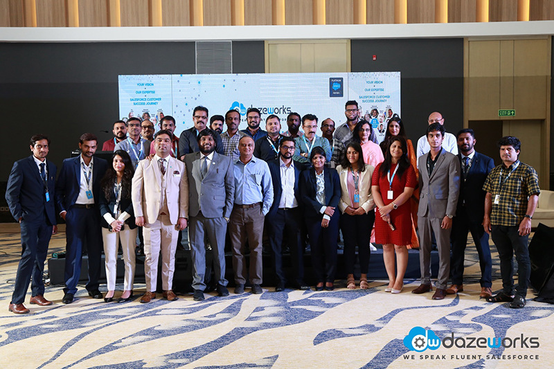

We are a pure play Salesforce consulting company and our story has all the elements of a startup - challenges and fun set with bouts of innovation. This has brought to us to where we stand today - as a young and passionate team of the best thinkers, consultants and developers offering a gamut of services ranging from Salesforce development and implementation to Appexchange and implementation to Appexchange and the Salesforce mobile app development.
Email: info@dazeworks.com
All the latest design guidelines are made available to you through our media kit
We speak through our logo. Our logo is the soul of our company branding. It depicts our story and uniqueness. The colors, tone, and visuals add to our individuality.

The Dazeworks logo is primarily in the Summer Sky Blue and Matterhorn Grey and are used in contrasting backgrounds.

When unable to use our primary logo we have a secondary logo in white font and can be used.

The minimalistic logo can be used only when necessary. Stick to the primary logo wherever possible.

The single color logo variant must only be implemented in-case of color restrictions on white or similar contrasting backgrounds.

The single color logo variant must only be implemented in-case of color restrictions on white or similar contrasting backgrounds.

The Dazeworks logo is primarily in the Summer Sky Blue and Matterhorn Grey and are used in contrasting backgrounds.

DO NOT Rotate the logo or its elements.

DO NOT change the color scheme of the logo

DO NOT compress, elongate or alter the form of the logo.

DO NOT detach the logo from the text.
The logo should be positioned in such a way that the elements of the logo are clearly visible and doesn't get washed out with the background. The logo should be varied according to the background and should be contrasting.
Through pictures, we transform our ideas into the audience by showcasing our organization's culture. The pictures should convey the Dazeworks journey in the best manner.
